
Platform Update - New Options For Headers
Jenny Marsden • May 7, 2020
Share This
New Capabilities In The Platform Website Header

Duda the platform I use has recently updated the capabilites of their desktop headers. By desktop headers I mean that these new features are only available for desktop views. Your tablet and mobile header will remain the same.
So what are they?
Overlap First Row
Despite it's very bizarre sounding name, Overlap First Row will enable you to make the image from the row directly below your header merge into your header menu. Effectively, this means that you can make your header background transparent and the image from the row beneath it will show as your background on your menu.
This is a great tool and will be very exciting for websites that have multiple images in the next row (adding multiple images to the background on a row makes a hero slider). These images will now get much more real estate and better exposure and if they are product images, that is a VERY good thing.
It also means that you don't have to have your image row such a deep row for clients to see the whole image. You can now make it merge into your header which means that the next section under your image row can be seen "above the fold" and encourage visitors to scroll down.
There are some considerations however:
Your images (if you use more than one) must have the same tone in the top of the image. If one is very light and one is very dark, your menu (if it is black text or white text) will look clear on one but not the other, so it is important to make sure that all your images are light or dark at the top of the image.
The other consideration is to make sure your images aren't too busy at the top. Again your menu will be very hard to see if the image has lots going on.
Shrinking Header Color And Image Changes
Duda's shrinking header is one of their best features. It is so simple but means that no matter how far down the page your visitor is, they can see the top menu. So valuable as a base feature.
They have now added the ability to change the colors and even the logo of that shrinking header. This means that if my header you can see above is white with black text, I could change it to be dark blue with white text on the scroll when it changes to the shrunken header. (Every time I type "shrunken header" I think about hiking the Head Hunters trail in Borneo!
You can even change the logo image. So as you see it now, my logo is Grey, however if I did edit the shrunken header to have a dark background I could change the image to be a white version of my logo to again make sure it is easily visible.
How To Acheive Both Of these Results
As always I find a video is a much easier way to learn how to make these changes than me typing endless instructions on the page during which you start to nod off about half way through.
This YouTube video below explains both these edits, shows you how to do them and things to be aware of. Comment on the video (or here) if anything is unclear.
If you are one of my clients and I've locked your header, just get in touch
and I will release it for editing for you.

Lets Connect
About Jenny
I started my IT career in Database Administration and .Net coding. While I LOVED that work, I realised very quickly that I also wanted a life. To be a top end coder or DB Admin, you have to comit your downtime to constantly learning and evolving and while that is also something I love, I wanted it to be my work and not my life. So I morphed my love of design with my knowledge of all things SEO and moved into building small business websites.
Why small business websites? I'm a small business myself and I know how hard it can be so I wanted to give my clients a great service, with an approachable point of contact where no question was a "stupid question".

So you don't find yourself locked out of your Google account, add a recovery email or an alternative email you can access anywhere.
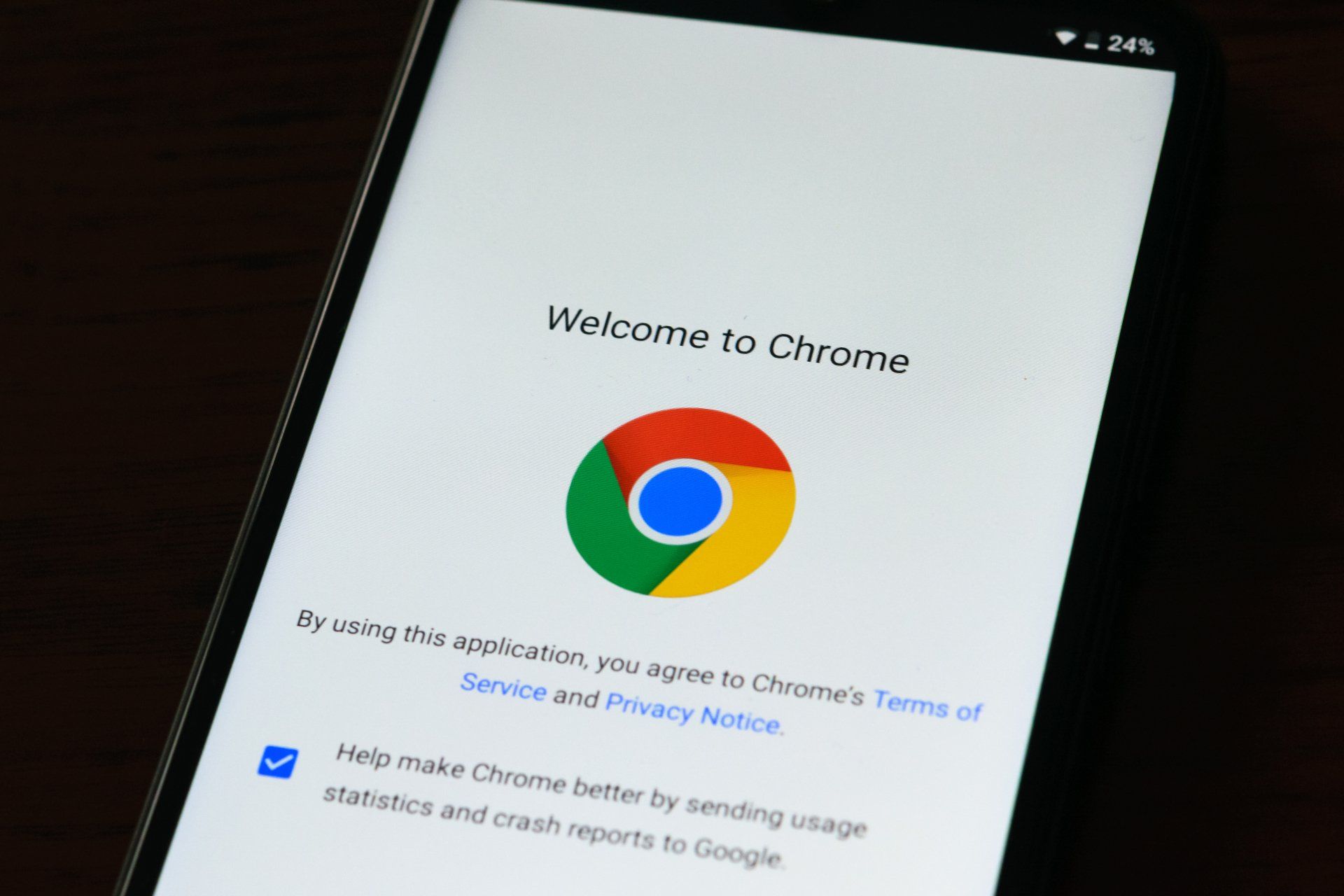
Are you having challenges with Chrome Browser using all your system RAM and slowing everything down? This Feature Flag from Chrome will help you to stop Chrome being such a RAM pig and set you on the path to better browsing.
If you are considering designing and developing your small business website yourself, there are a few considerations you should be aware of. Check out my list of what to think about when doing your own DIY website Vs getting a professional web design expert.
